Jilin Museum of Classic Art建成项目
back



Jilin Museum of Classic Art
Changchun China
吉林经典艺术博物馆
长春 中国
2017- 2018
unarchitecte
Abstract:
Through the deduction of arch modules and the application of visual tension principle, the design of the Jilin Museum of Classic Art, as a variant mosaic in the vertical urban space, creates a heterogeneous space order out of homogeneous standard floors of the office building, redefining the interior space of new cities built in the last few decades which expanded in a mechanical way.
Keywords:
form generation, tension, arch, space order
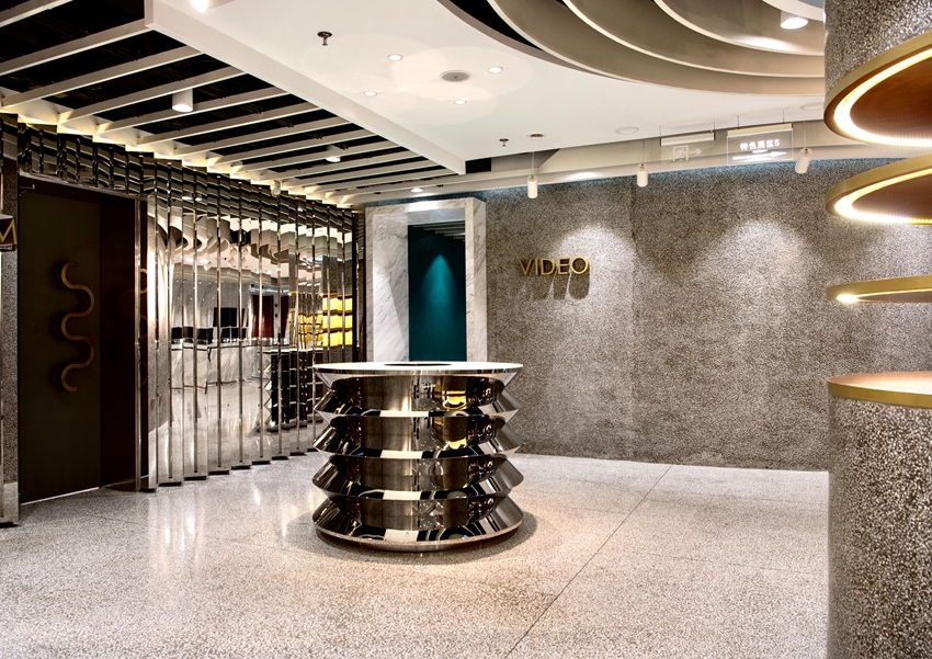
The Jilin Museum of Classic Art in a commercial high-rise building is located in the economic development zone in south suburb of Changchun. The building employs the tubular frame structure and frame-shear wall structure which are widely used in high-rise office buildings. Standardized floor plates often in rectilinear shapes are stacked up in vertical section to form towers, and towers are, then, arrayed across the land to create cities. The brutality of meaningless repetition has become a typical mode of urbanization in China. A solemnly named independent art space being placed in a standard floor of an office building, the conflict between acceptation and context, laid the foundations of the further design.
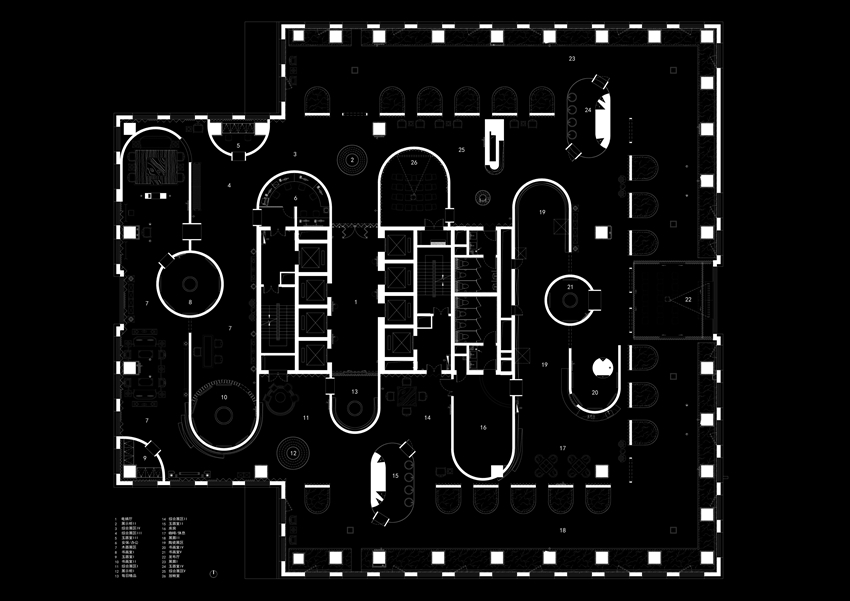
The architect focused on arch as a formative module, exploring its planar-metric conditions as opposed to the conventional role in section and elevation. There are two conventional theories about using arches in architecture: the authenticity based on material structure, for example the design of arches as the will of bricks explained by Louis Isadore Kahn; the symbolic meaning which is unlimitedly extended and abused in the context of postmodernism, for example the arched door of the Piazza d'Italia designed by Charles Moore. Instead of tag along with the signified aspect of the arch as a structure revealing the material authenticity or the signifier aspect of it as a symbol representing classical meaning, architect Zhang Hetian conceives a third strategy based on formal operations: a generative method focusing on the visual tension of arch and the dynamic composition of its variations. Arches once set in plan has tendentious visual tension, which makes the original space be pressed and divided losing its balance immediately. To rebalance the tension within the planar contour, the entire space order is dynamically adjusted according to the preinstall arch element. This kind of spatial organization with preliminary design elements is similar to the musical composition with designated scales, generating a variety of melodies according to certain rules.
Three approaches to the spatial order are identified by deducing the space at the early stage of the design scheme. First, hub-centred spatial layout. The exhibition space stretches out from the central hub to separate space. Second, two-layered spatial layout. Around the central hub forms the compact central layout which is surrounded by the peripheral space. Third, decentralized archipelago layout. The exhibition space scatters in the existing spatial structure as independent units. The final design integrates the three approaches.
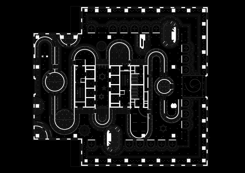
Specialization of the plane arch. The planar arch system is materialized into space. There are three pairs of formal generation rules with contradictory and unified elements in the transformation from plan to space, and from graphic to mass.
One-way and two-way stretches:
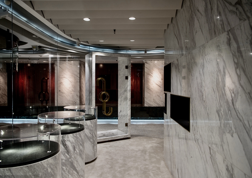
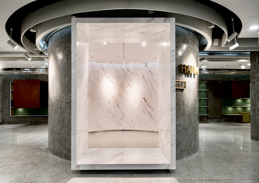
The plane arch stretches from the ceiling or the floor, and the process of spatializing is concluded when the top and bottom of the mass are connected. The plane arch can stretch from both of the opposite directions. For example, the opposite spatial structure shown in the floating exhibition stand and the C-space exhibition units.
Openness and Enclosure:
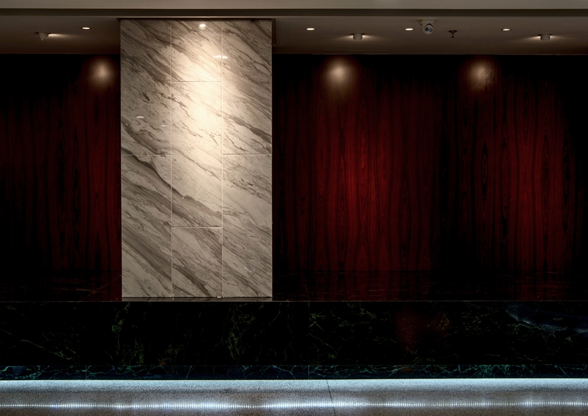
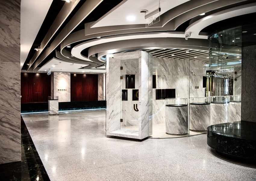
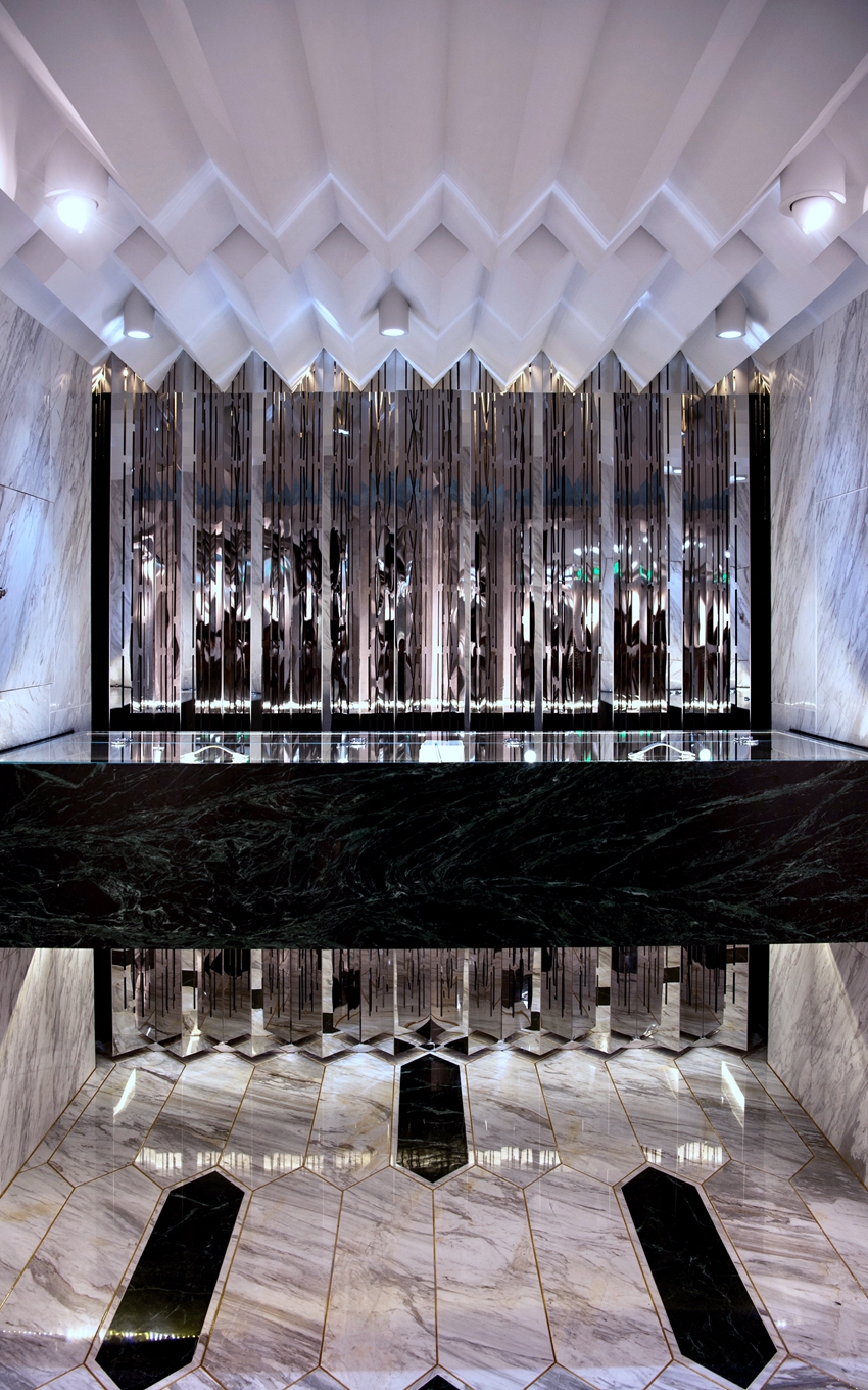
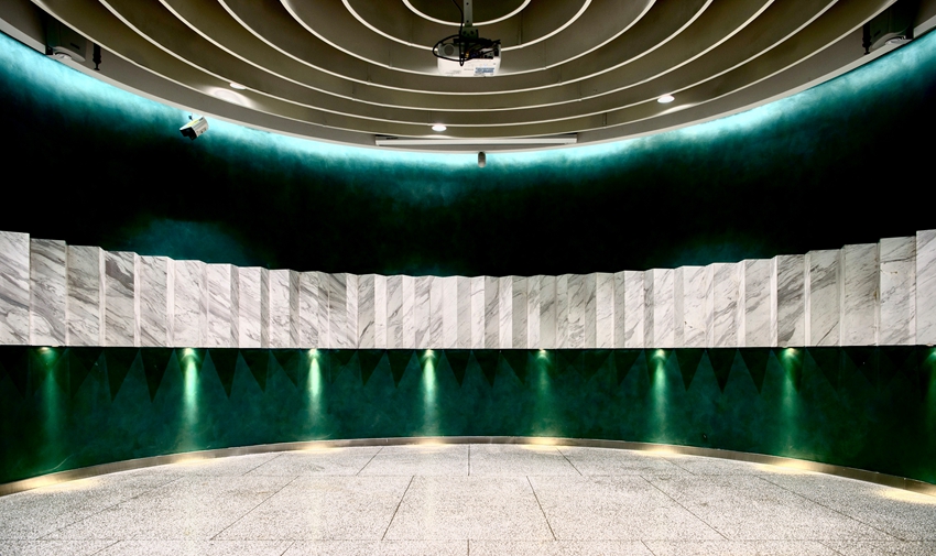
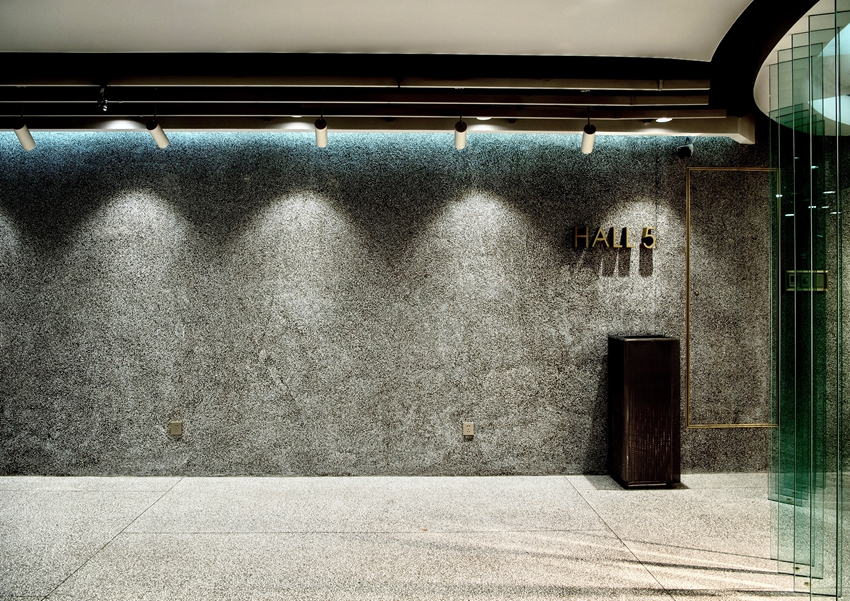
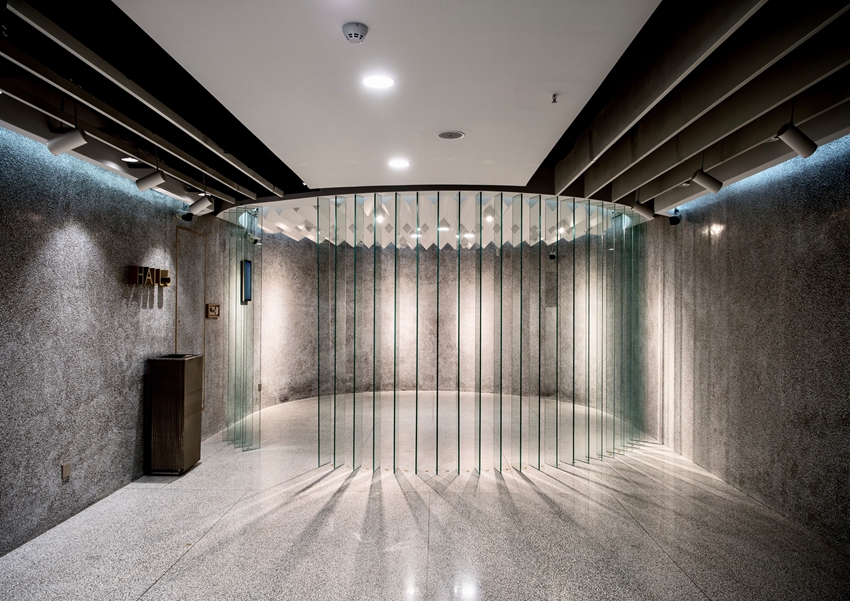
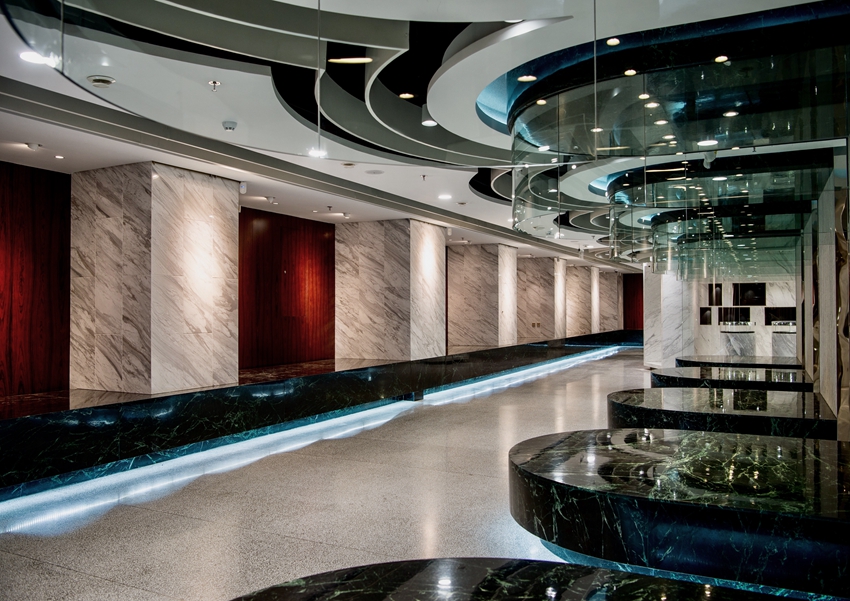
The openness and enclosure of exhibition units not only lead to the contrast feeling of openness and privacy, but also adjusts the tension of entire space after the spatialization of plane arches: The open glass grafting weakens the tension which looks as light as gossamer wings, while the solid mass of concrete (cast-in-place terrazzo wall and floor) strengthens the tension which looks as heavy as stones.
Transparency and Opacity:
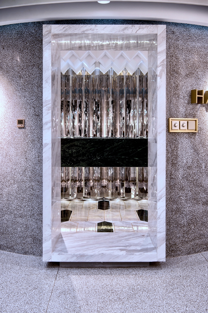
The transparency of the material can adjust the direction of visual tension. The transparent mass directs the line of sight to the exposed interior, while the opaque mass suppresses the line of sight to the compressed edge.
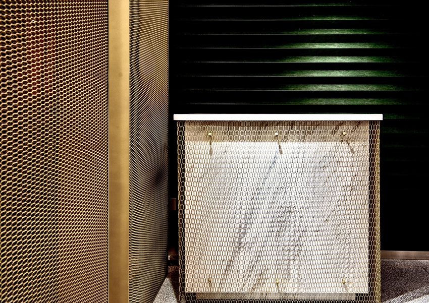
As a variant of the standard module of the urban space, the spatial design of the Jilin Museum of Classic Art uses arch as the fundamental spatial unit which are multiplied, altered, and composed under the principle of dynamic formal tension. The “fullness” is illustrated by the nesting of various spatial layers (central space - peripheral space - floating space) and the selection of diverse materials. Varied materials are utilized to strengthen or weaken the tension of spatial form, which is a provocation towards the all-purpose standard floor and a challenge to the minimalistic style of modern architecture. Reformed by the visual tension, the space order forms a way of recalling the vitality of space generation, as a rejection of the aloofness from less is more[1] of modernism and of the hypocrisy from less is boring[2] of post-modernism. The entire spatial structure is a homogeneous evolution of a formative module and supported by the invisible tension featuring contradiction and balance. Therefore, it develops with the variations of the arch tension, full but not blockaded with clear clues. In the transformation from plane arches to spatial mass, different material structures derive from different form rules. The whole process of design is a set of strict and systematic form generation methods which are not restricted by the material authenticity or the symbolic meaning. Instead, they represent the principle of the structural tension developed from the plane configuration of modern painting and the exploration of space organization from the perspective of visual consciousness. The interior space order constructed through this method is a critique of the mechanical repeat of the exterior space of the new city.
[1] by which Ludwig Mies Van der Rohe made a definition for the space order of modern architecture.
[2] which Robert Venturi took as a declaration of post-modern architecture against Mies.
摘要:
吉林艺术品博物馆通过对拱形造型单元的演绎与视觉张力原则的运用,在千篇一律的高层办公楼标准层中,创造了异化的空间秩序,作为城市竖向空间中变异的马赛克,重新定义机械扩张的新城的内部空间。
关键词:
形式生成、张力、拱形、空间秩序
吉林经典艺术博物馆位于长春市南郊经济开发区的一座高层商用建筑内。大厦采用了高层办公楼常用的筒中筒与框架剪力墙组合的结构形式,标准层的室内空间呈回字形,垂直叠加组成单体塔楼,塔楼再复制阵列构成新城形态。这种粗暴的空间增长方式是中国式新城建设的缩影。一个被严肃命名的独立的艺术空间却被放置在写字楼的一个标准层内,这个词义与语境之间的矛盾为此后的设计埋下伏笔。
建筑师将重组空间秩序的兴趣聚焦到了对一个特定造型单元的探索——拱形,并不断尝试其在平面中的组合。拱形在建筑设计中有两种约定俗成的使用逻辑:一种是基于材料结构的真实性,比如路易斯康将拱拟化为砖的建造意志;另一种是符号意义,在后现代的语境下被无限放大和滥用,比如查尔斯·摩尔设计的意大利广场中的拱门。建筑师张赫天对于拱的兴趣不在于拱作为结构对建造材料真实性的所指,也不在于拱形作为符号对古典意义的能指,而是基于形式生成的第三种策略——拱所具有的视觉张力和其动态组合后的空间变化。拱被放置在平面中的时候,就具有了倾向性的视觉张力,使得原有的空间被挤压和分离,并在瞬间失衡。为了使平面廓形内的张力再次达到平衡,整个空间秩序便在预设的拱元素的调节下动态调整。这种预设造型元素的空间组织方式,与指定音阶的谱曲创作相类似,可以在一定的章法下幻化出各种旋律。
从方案初期的空间推演中,我们可以看到三种空间秩序的划分思路。第一种是核心式空间布局。以交通核为中心,展陈空间自内而外划分空间。第二种是内外双层空间布局。在交通核周边形成紧凑的中央布局,同时外围空间环绕中央进行布局。第三种是岛状布局。展陈空间以独立的单元空间形态,散布在已有的空间框架中。最终的设计方案,是这三种空间布局思路的融合。
平面拱形的空间化
平面拱形体系物质化为空间实体。在这个从平面走向空间,图形变为体量的过程中,存在着三对矛盾统一的形式生成法则。
单向拉伸与双向拉伸。
平面拱形从天花或地面开始拉伸,当体量上下贯通时,空间化的过程便凝结。平面拱形也可以从两个方向相对而生,在悬浮展台和C型空间的展示单元中我们可以看到相对而生的空间形态。
开放与封闭。
展示单元不同的围合度(开放与封闭)不仅使被围合空间中的感受不同(公开与私密),同时也调节了平面拱形空间化后在整体空间中的张力的大小。开放玻璃格栅将张力弱化如蝉翼微拂,混凝土的敦实体量将张力强化似石碾翻滚。
透明与不透明。
材料的透明性可以调节平面拱形成为空间体量后的张力的视觉倾向,透明的体量将视线吸附到暴露的内腔,不透明的体量将视线压迫至挤压的边隙。
作为城市空间标准模块的异变体,吉林经典艺术博物馆的空间设计用预设的拱形作为空间语汇的词根,用形式张力的动态平衡原则作为空间组织的语法,填满了现有的标准层框架。这种“满铺”体现在不同空间层次的套嵌(核心空间-周边空间-悬浮单元),也体现在材料使用的多样性。用多样的材料强化或减弱空间形式的张力,这种手法是对标准层“万能空间”的挑衅和对现代建筑的极简主义风格的挑战。视觉张力重塑的空间秩序否定了现代主义空间“少即是多less is more[1]”的冷漠和后现代主义空间“少即是无聊 less is boring[2]”的虚假,形成一种唤醒空间生成原动力的方法。因为整个空间形式是一个造型单元的同构演化,又被对立平衡的张力作为无形的骨架支撑,所以整个空间随着拱形的张力变化起承转合,满而不塞,有清晰的可读性。在平面拱形拉伸为空间体量时,不同的形式法则衍生出不同的材料建构。整个设计过程是一套系统而严谨的形式生成方法,不拘泥于材料真实性的限制,也不附庸于符号象征性的表达,体现了一种从现代绘画平面构成中产生的形式张力组合的原则,这是从视知觉的角度对空间形式的探索。以此构建的异化的内部空间秩序,是对新城外部空间机械复制的批判。
Project Name: Jilin Museum of Classic Art
Architects: unarchitecte
Website: www.unarchitecte.cn
Email: office@unarchitecte.cn
Architect in charge: Zhang Hetian
Design Team: Zhang Hetian, Sun Qingfeng, Sun Jihua, Cheng Bingli, Zhou Qingjun, Jiang Shihua
Completion Year: 2018
Area: 2000m2
Address: Level 8, Block A, Hengfeng International Building, Changchun City, Jilin Province,China
Photographer: Xiaoqi + Zhang Hetian
Text: Wang Zhilei
Development company: Jilin Cultural Investment Group
Construction company: Jilin Overseas Decoration Engineering Co., Ltd.
Materials:Marble, Cast-in-place terrazzo, Felt board
项目名称:吉林经典艺术博物馆
建筑事务所:unarchitecte
事务所网址:www.unarchitecte.cn
邮箱:office@unarchitecte.cn
主创建筑师:张赫天
设计团队:张赫天,孙青峰,孙际华,程炳立、周清军、蒋施华
地点:吉林省长春市恒丰国际大厦A座八层
建成时间:2018
建筑面积:2000m2
摄影:晓柒+张赫天
撰稿:王志磊
建设单位:吉林文投集团
施工单位:吉林省海外装饰工程有限公司
主材:大理石,现浇水磨石,毛毡
